HOKA Navigation UX Design
Collaborative Research | UX Design | Design LeadRedesigning HOKA’s Navigation: Guiding Every Step with Clarity
HOKA has earned a loyal following for its bold, performance-driven footwear. But on hoka.com, the top navigation wasn’t keeping stride with the brand’s growth. As the catalog expanded—running, trail, hiking, recovery, lifestyle—users struggled to quickly locate the right products. Many defaulted to “View All” or on-site search, missing the breadth of what HOKA offers.
This friction created hesitation, misaligned merchandising opportunities, and ultimately, lost revenue. Our challenge was straightforward but significant: How can we design a navigation system that feels intuitive, inspires discovery, and aligns globally across markets?
The Big Questions
To guide the work, we posed four key questions:
Do customers understand the way HOKA categorizes products, or does the taxonomy create confusion?
How well do activity-based paths (e.g., Walking, Running, Hiking) align with real customer search behavior?
Where does navigation break down—causing users to abandon or switch to search?
What design patterns from competitors and industry leaders could we adapt to build a best-in-class experience?

Identify pain points in UGG’s current sizing utilities on product detail pages and design improvements that increase customer confidence in selecting the right size—whether shopping for themselves or others. The ultimate goal was to reduce size-related friction, abandoned carts, and returns.
Our Research Approach
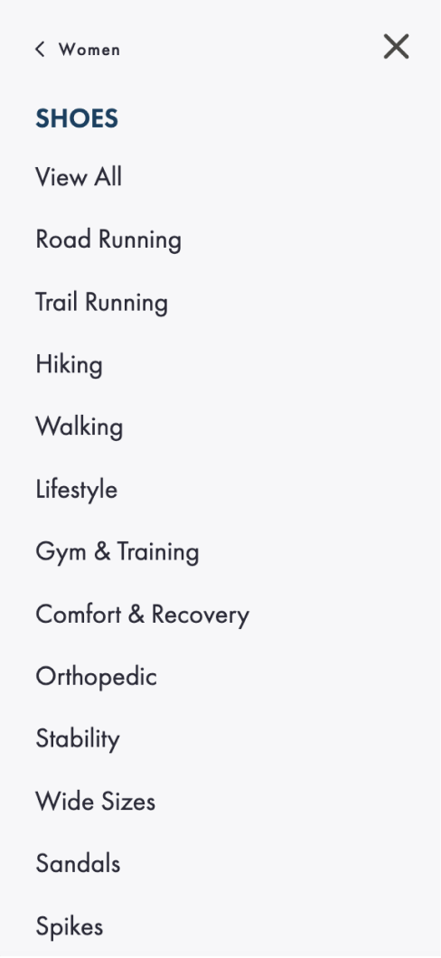
The previous design was overwhelming and required clicking thorough multiple pages of categories.

We used a multi-method approach to capture the full picture:
Tree Testing: Two rounds with 100 HOKA customers revealed pain points and tested improvements to the product construct. Version 2 showed significant gains in helping users reach the correct category directly.
SEO Analysis: Surfaced the rise of specific category searches for critical categories to highlight in navigation.
Fullstory Heatmaps & GA Data: Identified the top clicked categories, and those that lagged. Conversion rates showed clear differences by subpath.
Competitor & Best Practice Review: Studied navigation strategies from competitor brands and best practice guidelines from Baymard to inform design requirements.
Stakeholder Workshops: Partnered globally to balance user needs with brand storytelling and merchandising priorities.

For users, it’s not all about running. Search volume for other categories show that new users are not always looking for “Running”; branded searches show runners already know HOKA—making other categories key entry points to guide new users on their shopping journey. Users want clarity, not jargon. Confusion arose around categories like “Recovery” and differentiating Training vs. Racing, prompting us to iterate solutions to satisfy users will driving business goals. Competitors lean into visuals and storytelling. Imagery, thematic resources, and integrated search improved discoverability elsewhere—and offered a path forward for HOKA. Over-reliance on “View All” signals friction. Too many users bypassed structured categories altogether, causing users to bounce.
Design Requirements & Solutions
1. Reframe Categories Around User Language
We replaced internal jargon with activity-driven, SEO-backed labels to align with how customers actually search.
2. Clarify Activity Distinctions
Introduced clearer divisions between Training vs. Racing and Road vs. Trail Running to better match user intent.
3. Elevate Walking as a Top-Level Path
Highlighted “Walking” directly in navigation to capture and serve growing demand.
4. Reduce Reliance on “View All”
By reducing cognitive load of the complex product construct and improving category clarity, we designed a navigation that users could more easily digest and utilize to find what they landed on site for.
5. Incorporate Visual & Thematic Elements
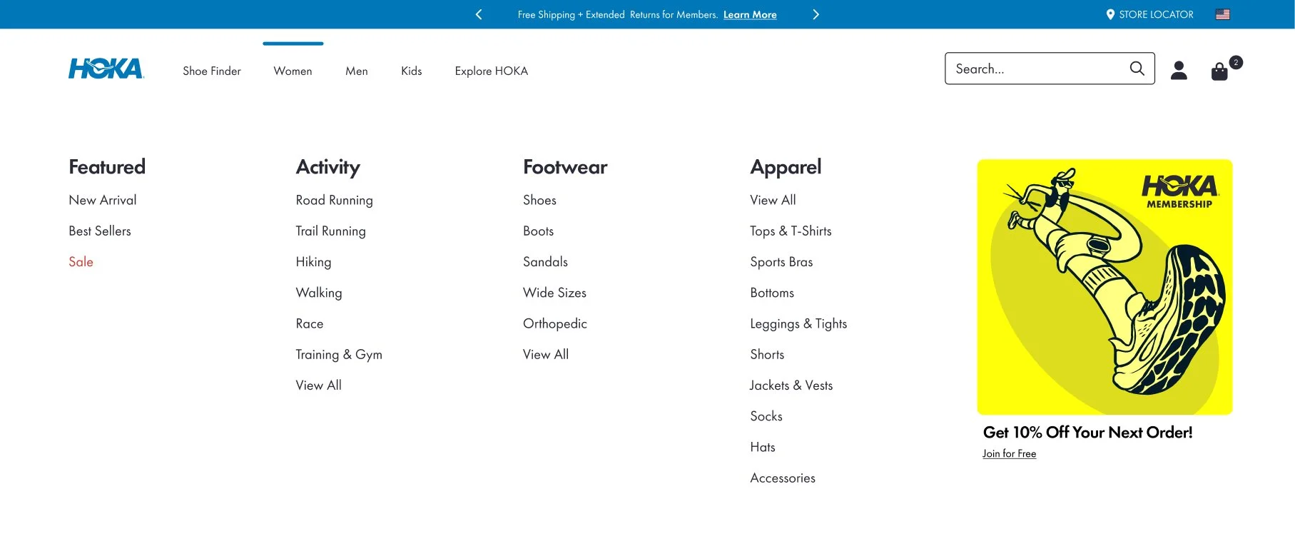
Brought in inspiration from competitors: image-driven navigation, thematic collections, and content blocks for membership, collaborations, and technology storytelling.
6. Mobile-First Navigation
Adopted best practices around pagination, hierarchy, hover delays, and micro-interactions to ensure the system feels smooth and scalable across devices.

Ultimately, the new HOKA navigation lays the foundation for a globally aligned, user-first system that reduces friction, unlocks merchandising opportunities, and connects customers to the right products faster—whether they’re marathoners, trail explorers, or everyday walkers.
Research into product construct streamlined categories, while the accordion-style pagination puts products directly in front of users in one screen view.

Previous navigation was overwhelming and dated.
The new design delivers a fresh look, refined spacing, and a simpler path for users to find what they need.

